Rauschenberg’s Book of Genesis
This Is the First Half of a Print Designed
to Exist in Passing Time
Terry Winters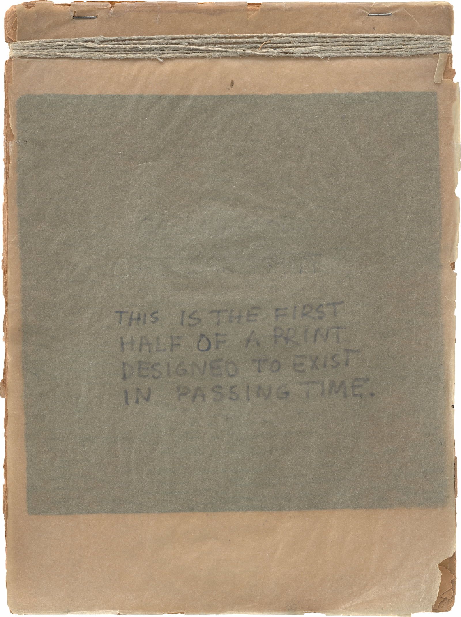
37 This Is the First Half of a Print Designed to Exist in Passing Time, ca. 1951–52. Fourteen woodcuts and transparent paper with pencil, mounted on paperboard with twine and staples; overall 12 × 9 × ⅜ in. (30.6 × 22.9 × 0.8 cm), each sheet 12 × 9 in. (30.6 × 22.9 cm). Robert Rauschenberg Foundation, New York
This is the beginning. Robert Rauschenberg’s book of Genesis. His foundational text and establishing document. Unformed and void, darkness was on the face of the deep, and this inaugural work graphically stages “light borne in darkness.”1 Rauschenberg sees the light in terms of time and materials and demonstrates the physical process of moving from inky blackness toward a bright, imaginary destination. The conclusion needs to be drawn.
The work itself consists of fourteen woodcuts on paper. The prints are stapled together and partially adhered to a paperboard support. Along the top, they are bound with twine. The enigmatic title is written in pencil on a cover sheet of tracing paper, and a ghostly image of the first print, visible through the translucent layer, is a component of the composition. All fourteen prints were made from a single woodblock, into which Rauschenberg made a succession of cuts, adding one more or less straight line across the block at each stage. Progressive proofs were pulled, producing a visual record of each separate printing.
THIS IS THE FIRST HALF OF A PRINT DESIGNED TO EXIST IN PASSING TIME (ca. 1951–52; 37) is essentially an album of trial proofs—in this case, of monoprints. In printing, impressions are generally taken to track the progress of a work and the condition of the matrix. “Proof” here is used in the sense of knowing if something is true or correct. Usually, trial proofs are steps along the way to the final state of a plate or block. For this piece, however, each cut is documented. Each page shows incremental changes, made progressively. Discrete moments. Short intervals in passing time. Physical parts of a larger, imaginary whole, the prints constitute the first half of what one envisions will eventually become a fully cut block. The work is a disappearing act, and in an ideal world, the sequence would end in a total blank. An empty sheet. But a completely cut and printed woodblock would reveal the raised edges from the application of the chisel or knife. Indications of the working process, with a resulting pattern of ridges and marks. A roughened field. Rauschenberg is operating between the actual and the virtual, and he leaves us at the midpoint. The true location, perhaps, of the famous gap between art and life.2
The artwork itself was made at Black Mountain College, which may account for its art-school feeling. Maybe it was the result of a class exercise or assignment, using the supplies on hand in the printshop. It renders an oversize and primitive animation. Almost cinematic. Like a flip-book. Or more like a calendar, another marker and measure of time. In fact, earlier inscriptions on the title page read, first, “CALENDAR OF,” then “CALENDAR PRINT.” At least as far as can be gathered from the remaining evidence of erased text on the title page. And the configuration of the work seems to have been taken from the wall calendars typical of the time. One of those popular, page-turning, month-by-month household items, usually accompanied by a photograph or an illustration. I suspect an actual calendar provided the physical dimensions. How else to explain the odd format? And the number of pages: Do they represent two weeks, half of an imaginary calendar month? So much of Rauschenberg’s work is based on found objects. Or determined by already existing material—taken, as evidence, from “real life.”
Rauschenberg remembers having just such a childhood object. A calendar with a reproduction of George Frederic Watts’s painting Hope (1886).3 That, he recalls, and a deck of playing cards with images of Thomas Gainsborough’s Blue Boy (ca. 1770) and Thomas Lawrence’s Pinkie (1794) on the back were the only “artworks” in the family home.
The final, handwritten title, THIS IS THE FIRST / HALF OF A PRINT / DESIGNED TO EXIST / IN PASSING TIME, is a perfect, radical statement. It positions this handmade object as conceptual folk art of a sort, delivered in Rauschenberg’s characteristic block lettering. The wording also serves as an introduction to his overall program and motivations. Language is a shaping force for Rauschenberg. It determines the thematic parameters of each body of work, amplifying possible meanings and helping to deliver his essentially poetic vision. His titles are texts, organizing principles, and the work is both visual and linguistic from the outset. An index of signs and subjects. Rauschenberg described his 1953 Erased de Kooning Drawing (105) as “poetry,” a positive spin on the typical anti-art and Oedipal readings.4 That same elegant, poetic intention seems to drive him toward an event-filled emptiness. A Zen-like desire for clarity and lightness. This is the spiritual underpinning of IN PASSING TIME—to always be at the beginning. A perpetual fresh start. From one situation to another. To trace and erase. Drawing, for Rauschenberg, is always a transfer—an actual-size transcription of existing material. De Kooning, degree zero.
And the extent to which this simple, calendar-like object foretells Rauschenberg’s artistic approach is remarkable. Calendars are tools that measure astronomical movement. They track the day (one rotation of the earth on its axis), the month (one revolution of the moon around the earth), and the year (one revolution of the earth around the sun). The movement of IN PASSING TIME, from darkness to light, tracks the enlightenment Rauschenberg would seek through labor and devotion. Be fruitful and multiply. Truly. And the numerous artworks that would follow over the next several years record that insightful development, both aesthetically and personally. An exploration of vital themes takes place: substance and color; time and space; sex and spirit. These issues pervade Rauschenberg’s early years. And they are made manifest by way of his intuitive approach and direct engagement with object making. He has the visual equivalent of perfect pitch. Seemingly random, every mark is precise in its gesture, touch, and location. Rauschenberg has an uncanny capacity for the right move, in his choice of materials and the exacting architecture of his compositions. Each body of work establishes a conceptual framework to be explored as felt experience. And it all starts here, once upon a time. A story of foundations, influences, and Rauschenberg’s inexplicable and incandescent originality.
That this work is a print is significant. Printmaking plays an important role in Rauschenberg’s production. It is always on an equal footing with painting and sculpture, without any sense of hierarchy among them. That is the case here, especially when we view IN PASSING TIME in conjunction with another early project, Automobile Tire Print (1953; 104), a nearly twenty-four-foot-long paper scroll impressed with black paint by John Cage’s Ford Model A. Seen together, the two works are a treatise on time: first, as discrete moments over fourteen bound pages; second, as a continuous flow across twenty sheets of paper. The book and the scroll are temporal models and spatial objects for the distribution of information—an issue of great import in all of Rauschenberg’s work. Printing delivers data, and the organization of documents across printed or painted surfaces is fundamental to Rauschenberg’s project. Leo Steinberg’s celebrated flatbed picture plane is, after all, a term borrowed from the flatbed printing press. And that mindset, as well as message, is determined by the medium.
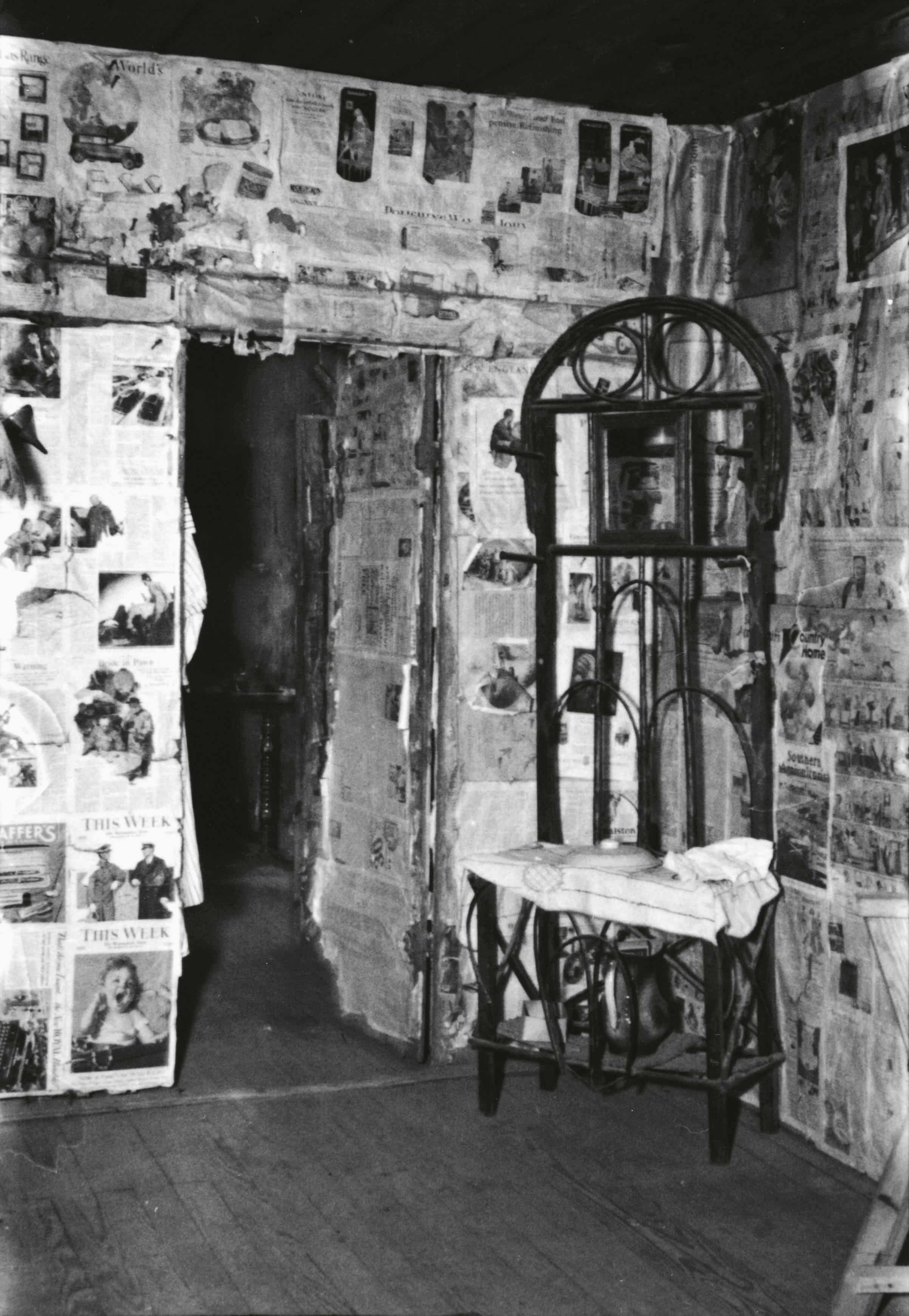
Fig. 1. Walker Evans, [Interior with Newspaper-Covered Walls and Wicker Mirror Stand, Hale County?, Alabama], 1936. 35 mm film negative. The Metropolitan Museum of Art, New York
In declaring this first print project “designed,” Rauschenberg signals the legacy of the Bauhaus at Black Mountain and the impact of Josef Albers, who played a profound role in determining the direction his student’s work would take. Or not take. Rauschenberg went to Black Mountain seeking Albers’s discipline. And he was looking especially for a framework to structure his energy, a way to channel his wilder instincts. At that point, his approach was largely sensuous; he was painting directly with his hands, finding even the use of brushes too distancing. Rauschenberg was making a mess, and he wanted the management skills Albers seemed to offer. His systems thinking, his guidance. Rauschenberg clearly benefited from Black Mountain and Albers’s instruction, but there was also friction. Albers wasn’t easy to talk to, and Rauschenberg was intimidated; he found his teacher’s criticism both excruciating and devastating. Still, Rauschenberg considered Albers the most important teacher he ever had.5 A touchstone in his development.
Rauschenberg shared Albers’s avoidance of emotional expression and admired his straightforward presentation of facts.6 Albers’s formal grammar, use of photographic documentation, symmetrical composition, and truth to materials all resonated with and mattered to Rauschenberg. What he resisted was his teacher’s strict, rules-based approach, and especially Albers’s controlling methods as applied to color. Why should one want to employ red to intensify green? That notion offended Rauschenberg. His feeling was that each color was itself, a sensibility evidenced by his early work exclusively in monochromes. Initially, he limited his use of color to blacks and whites. Even producing bodies of work that were either all black or all white, to avoid any decisions involving color. It’s important to know that the White Paintings and the Black Paintings were done at nearly the same time. Walter Hopps spoke of them as two faces of the moon.7 The flatly painted, uninflected White Paintings are in direct contrast to the variegated surfaces of the Black Paintings. That analogy seems right: Those pictures have a strange lunar quality, as do the Night Blooming works of 1951, with their white orbs and crescents. Floral and nocturnal evidence. Near and far, as phases of matter. The two groups of paintings exist together, like the first physical pages and the phantom future pages of IN PASSING TIME. It was a couple of years before Rauschenberg worked his way forward to the Red Paintings, eventually developing his own productive sensibility. Alternatively, he used the colored substance of a material itself as both object and subject. Dirt, gold, clay, wood, stone. Their colors are determined by the specific wavelengths of light absorbed and reflected by their surfaces, and their meanings are affected by their status and function. Rauschenberg rejected chromatic manipulation in favor of the material and immediate emotional presence of color. Perhaps his focus on the monochrome was triggered by his exposure to Albers’s color-theory class. Rauschenberg’s very own, traumatic “interaction of color.”8 Maybe that experience triggered his first black monochrome.
In IN PASSING TIME, these concerns are expressed through the dense, dark value of the woodblock and its neutral newsprint ground. It has an everyday, ordinary feeling. Rauschenberg’s chromophobia makes this also the unofficial start of the Black Paintings, where actual newspapers would be used to produce a textured support. And provide a “gray map of words” as an entry point and guide for his application of paint.9 A predetermined scaffold, giving off the suggestion of Depression-era farmhouses, with their walls covered in newspapers as improvised insulation. Echoes of Walker Evans (fig. 1), as the consideration here was also economic.10 Newspaper was a fast and cheap way to gain texture. And black and white were the least expensive paints. That is one reason they were popular with an entire generation of painters. As de Kooning once said, “I needed a lot of paint. … I could get a gallon of black paint and a gallon of white paint—and I could go to town.”11
And the open space of that last hypothetical page of IN PASSING TIME anticipates the blank, colorless White Paintings. The “airports for lights, shadows, and particles” that John Cage so admired.12 Rauschenberg called them “clocks,” capturing ambient light as the day passed.13 The paintings demonstrate the impossibility of emptiness. Looking, like listening, happens in time, and stillness equals silence. It also suggests a sacred dimension: “1 white as 1 GOD.” That was Rauschenberg’s formulation, speaking of the White Paintings in a letter to Betty Parsons written after his first show at her gallery.14 This is straight out of his religious upbringing. The Church of Christ teaches the unity of spirit, and that spirit is found in seven forms, detailed in the book of Ephesians: one body, one spirit, one hope, one Lord, one faith, one baptism, one God.15 Seven is also the number of components Rauschenberg made to suggest the modular continuity of the White Paintings—a happy coincidence of divine and minimalist calculation. And another possible calendar reference, to the days of the week.
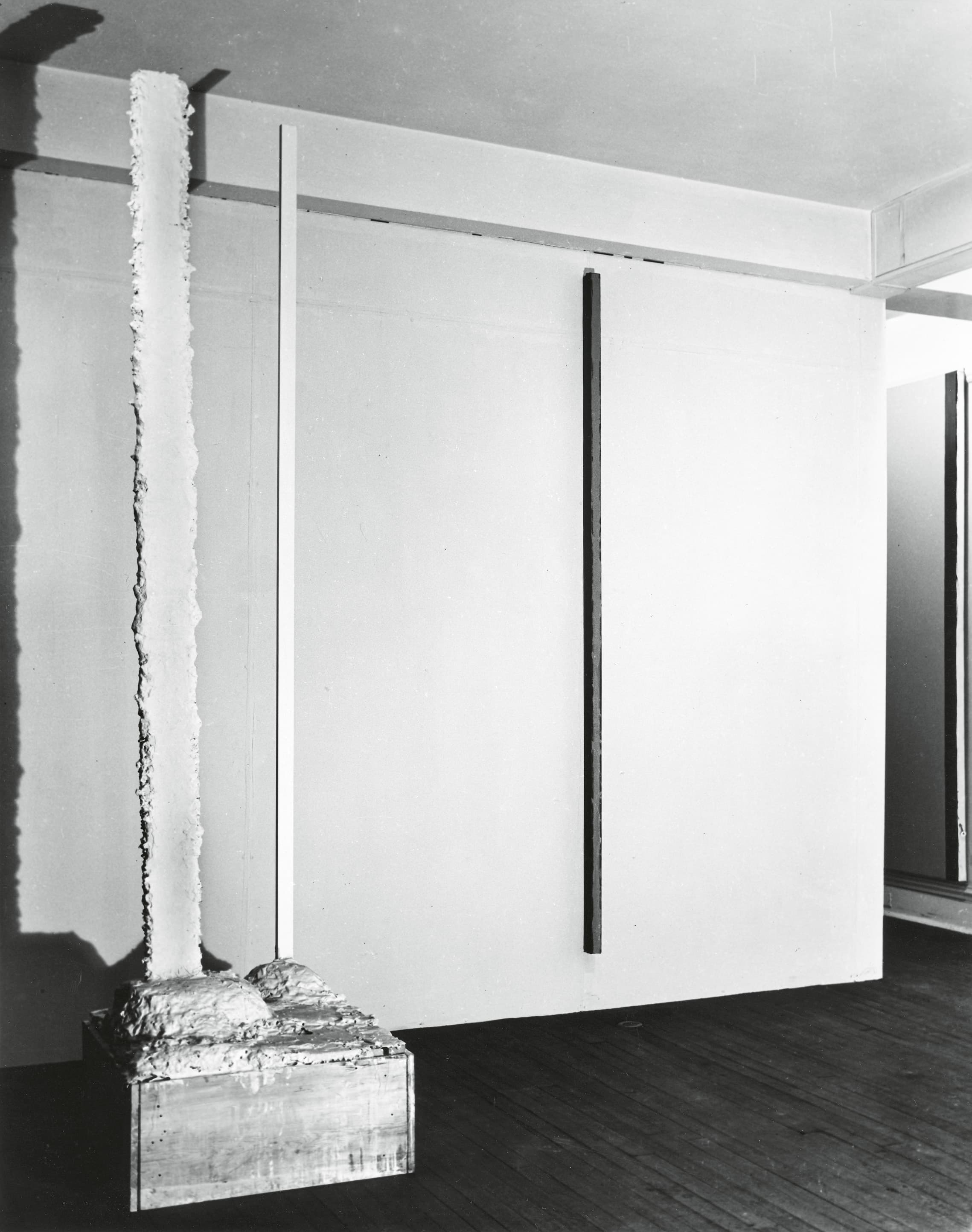
Fig. 2. Installation view of Barnett Newman (Betty Parsons Gallery, New York, April 23–May 12, 1951). Works shown (left to right): Here I (1950; The Menil Collection, Houston), The Wild (1950; The Museum of Modern Art, New York)
In a sense, Barnett Newman laid the spiritual foundation and gave permission for Rauschenberg’s subsequent position. Newman emphasized the importance of metaphysics in the production of contemporary art through his writing and the exhibitions he curated at Betty Parsons Gallery. It is also significant that Newman’s second solo show at Parsons (fig. 2) immediately preceded Rauschenberg’s show there. Following the principles he had outlined in a short text for The Ideographic Picture,16 an exhibition he co-organized with Parsons in 1947, Newman opted not to title his works in either of his solo shows at her gallery. The characters, symbols, or figures of a painting were meant to suggest ideas, without expressing a specific name. His paintings were Talmudic statements spoken in the language of Abstract Expressionism. The metaphysical content was a direct message from the painting to the viewer. Newman’s modernist/primitivist model provided another spiritual dimension for Rauschenberg. And his response was instinctive and immediate. He was a believer—certainly in the form, if not in all of the content. He was drawn to Newman’s exhibitions at Parsons, and it was his curiosity about that world and his possible connection to those painters that had led him, with his works in tow, to visit the dealer in the first place. Now, his job was to find his own way, his own place. Ultimately, Rauschenberg rejected self-expression and let the world in, and contrary to Newman’s example, Rauschenberg named names.17 Pagan Void (fig. 3) becomes Mother of God (1951; 17). Newman’s terror of being emerges as Rauschenberg’s unconditional love.
Rauschenberg’s 1951 exhibition at Betty Parsons was spiritual in nature—a testing ground for his religious beliefs. Or for conflicts he was struggling to resolve. He engaged with a surprising mixture of Protestant, Catholic, Jewish, and modernist references. The works were playfully funny and deadly serious—both at the same time. However, the remnants of his upbringing were still felt. He remained a churchgoer in New York well into his twenties. Giving that up was a major change in his life.18 Mother of God presents a large, mysterious rounded object floating above a patchworked Rand McNally atlas. See the U.S.A. in your Chevrolet.19 And as noted in a clipping at the bottom of the painting, The Catholic Review provides “an invaluable spiritual road map … as simple and fundamental as life itself.” Crucifixion and Reflection (16) presents the masthead of a Yiddish newspaper hovering to the right of the cross. Eden (19) is an absurd, abstract cartoon garden. Trinity (20) is a sequence of flash frames, an unavoidable association with the world’s first, then still recent, nuclear bomb test.
A few paintings in the exhibition, with their collaged surfaces, could almost be seen as precursors of Combines, most particularly Should Love Come First (18). With a title sourced from a popular magazine (True Confessions), the painting, in its constellation of images, displays a range of subjects that would hold lifelong significance for Rauschenberg.20 The collaged elements include a circular diagram of air-travel times and distances, a postage stamp, a reproduction of a painting by Claude Monet, the imprint of a bare right foot, and a dance-step instruction sheet. But the poignancy of the moment must not be overlooked. Rauschenberg’s marriage was in crisis, with his wife, the artist Susan Weil, pregnant and his relationship with Cy Twombly gaining momentum. Rauschenberg is literally asking himself the question the painting poses: Should love come first? The answer was possibly found a couple of years later, when, in a decisive gesture, he painted over the picture, obliterating the question itself. This new, revised work joined his then-ongoing series Black Paintings, to become Black Painting (84).
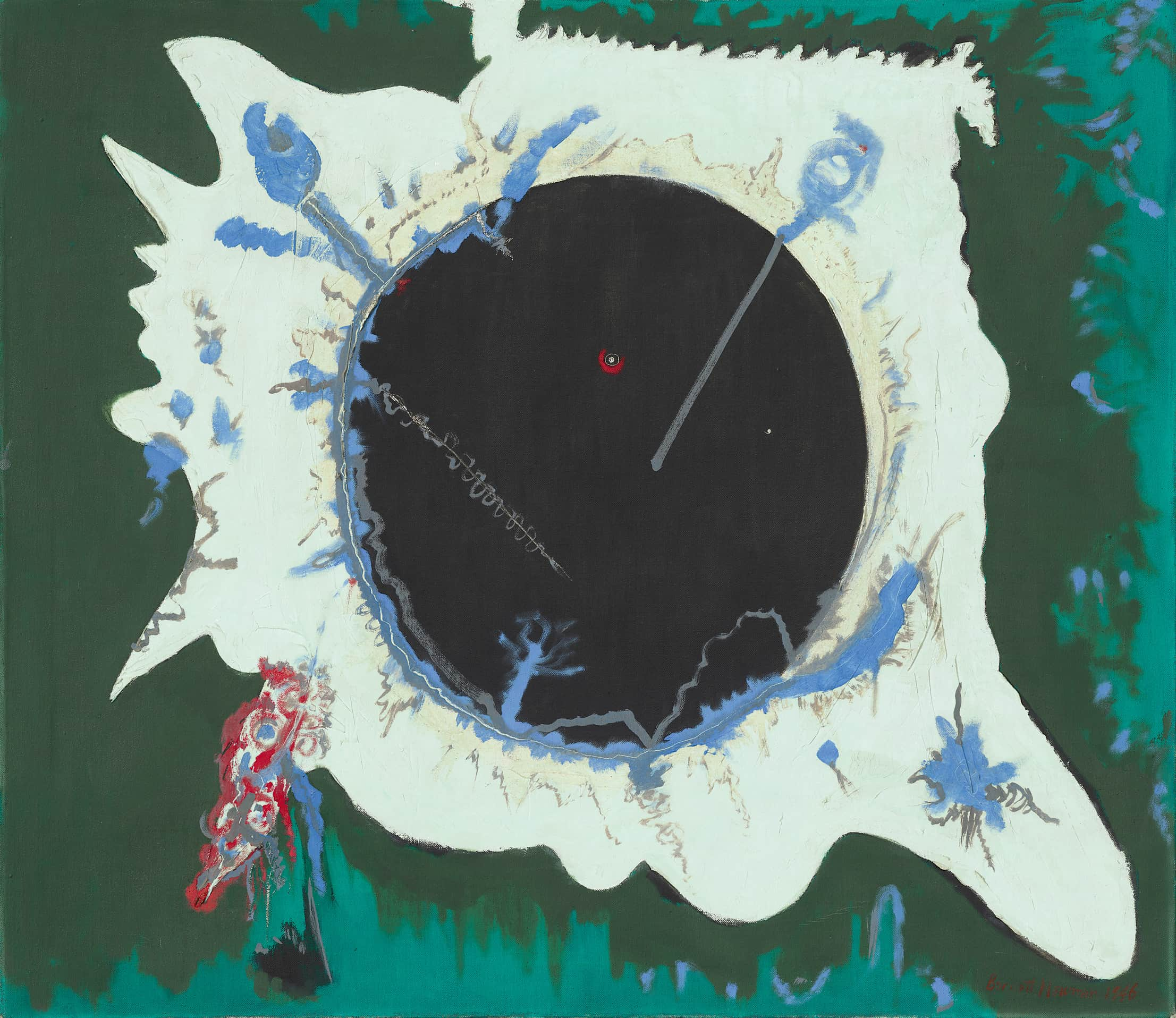
Fig. 3. Barnett Newman, Pagan Void, 1946. Oil on canvas, 33 × 38 in. (83.8 × 96.5 cm). National Gallery of Art, Washington, D.C.
Newman established a theological paradigm, but he also provided an important formal model. He was one of the first Americans to make totally black paintings, and the white-on-white painting included in his second solo Parsons show offered Rauschenberg an immediate precedent. As did the tall, narrow format Newman favored, which would be reflected in much of Rauschenberg’s work of this period. Likewise, Here I (1950; fig. 2), the solitary sculpture in Newman’s exhibition, made of plaster, wood, and a jerry-rigged milk crate, must have struck a sympathetic chord. The two artists were friends and maintained a relationship over the years. Newman attended Rauschenberg’s dance performances, and he was the only artist of the older generation present at the opening of Rauschenberg’s 1963 Jewish Museum retrospective. “I wanted to stand with Rauschenberg,” Hopps remembered Newman saying.21
Signposts of inspiration and illumination exist all along the way. They extend from IN PASSING TIME’s metaphoric book of Genesis to the early Combines, specifically to Hymnal (1955; private collection), a work that includes an actual book, the Manhattan telephone directory. A double reference, both to a Christian songbook and to Franz Kline’s phone book drawings (ca. 1950–54). And ultimately, a recognition of his own strict religious past and permissive urban present. Rauschenberg is finding his own sense of self and place. In the process, he manages to redefine the nature of representation and abstraction. Everything exists for Rauschenberg as information. Everything is up for grabs. A holy mixture of high and low. He finds salvation in the streets, transforming found materials into artworks. The Combines approximate spirituals. Songs of joy and praise from Lower Manhattan. An assembly seeking radiance, like that imagined light at the end of his first woodcuts. It is the energy gleaned from combination and connection that drives Rauschenberg’s sense of spirituality. The Gospel of Bob. Never sentimental or sanctimonious, he offers a life-affirming grace.22 Lessons learned from the Good Book and the Golden Rule. A lifelong ethics of respect and reciprocity. In that spirit, we can all, like Barnett Newman, “stand with Rauschenberg.”
Editors’ Note: The author has chosen to render the title of the primary work under discussion entirely in capital letters, following Rauschenberg’s inscription on the cover sheet.
Light Borne in Darkness is the title of a cyanotype made by Rauschenberg and Susan Weil (ca. 1951; RRF 51.E007).
⤴Robert Rauschenberg, statement, in Sixteen Americans, ed. Dorothy C. Miller, exh. cat. (New York: Museum of Modern Art, 1959), p. 58.
⤴“The only painting I knew (and I didn’t know it was ‘a painting’ until much later) was Hope—the woman sitting on a globe with her head in one of those bandage-nooses and I think a lyre? and the water lapping up around her? that green you only get in reproductions!” Rauschenberg, quoted in James Schuyler, “Is Today’s Artist With or Against the Past?,” Artnews 57, no. 4 (Summer 1958), p. 56. One of the two versions of Hope painted in 1886 is now in Tate’s collection (N01640).
⤴Robert Rauschenberg: Man at Work, directed by Chris Granlund (BBC/RM Arts with Solomon R. Guggenheim Museum, 1997), VHS video, at 30:40.
⤴Rauschenberg, typed statement on Josef Albers, n.d. [ca. 1964], Robert Rauschenberg Papers, RRF Archives.
⤴“I’m still learning what he taught me, because what he taught had to do with the entire visual world. He didn’t teach me how to ‘do art.” … When he taught watercolor, for example, he taught the specific properties of water color [sic]—not how to make a good water color picture.” Ibid.
⤴“If Rauschenberg is going to do White Paintings, he’s then going to do Black Paintings. … This one is beautiful with its articulated surface and its glossy black nature. It’s the other side of the moon from the whites, but they’re related.” Walter Hopps, video interview of Rauschenberg by David A. Ross, Hopps, Gary Garrels, and Peter Samis, San Francisco Museum of Modern Art, May 6, 1999, transcript, p. 37, SFMOMA Archives.
⤴Josef Albers, Interaction of Color (New Haven, Conn.: Yale University Press, 1963).
⤴Rauschenberg, quoted in “How Important Is the Surface to Design?: Robert Rauschenberg; An Artist Explains,” Print (New York) 13, no. 1 (Jan.–Feb. 1959), p. 31.
⤴James Boaden expands on the resonance of Evans and other Depression-era photographers in his essay “Black Painting (with Asheville Citizen),” Art History 34, no. 1 (Feb. 2011), pp. 166–91.
⤴Willem de Kooning, “Interview with Willem de Kooning,” by Harold Rosenberg, Artnews 71, no. 5 (Sept. 1972), p. 57.
⤴John Cage, “On Robert Rauschenberg, Artist, and His Work,” Metro (Milan), no. 2 (May 1961), reprinted in Silence: Lectures and Writings by John Cage (Middletown, Conn.: Wesleyan University Press, 1961), p. 102.
⤴Rauschenberg, interview by Ross, Hopps, Garrels, and Samis, May 6, 1999, p. 37.
⤴Rauschenberg to Betty Parsons, postmarked Oct. 18, 1951, Lawrence Alloway Papers, 1935–2003, series II.A, box 16, folder 4, Getty Research Institute, Los Angeles. See p. 250.
⤴“There is one body and one Spirit, just as you were called to the one hope of your calling; one Lord, one faith, one baptism, one God and Father of all, who is above all and through all and in all.” Ephesians 4:4–6 (New Revised Standard Version).
⤴B. B. [Barnett] Newman, statement accompanying checklist, The Ideographic Picture, Betty Parsons Gallery, New York, Jan. 20–Feb. 8, 1947, Betty Parsons Gallery Records and Personal Papers, 1916–1991, series 2, box 18, folder 40, AAA.
⤴The annotated checklist for Rauschenberg’s 1951 show at Parsons lists ten works with titles and another seven that are numbered. Betty Parsons Gallery Records and Personal Papers, 1916–1991, series 1, box 14, folder 20, AAA.
⤴John Richardson, “Rauschenberg’s Epic Vision,” Vanity Fair, no. 445 (Sept. 1997), p. 283.
⤴On Mother of God, see Susan Davidson, “Mother of God,” Rauschenberg Research Project, San Francisco Museum of Modern Art, July 2013, https://www.sfmoma.org/essay/mother-of-god/. “See the U.S.A. in Your Chevrolet” is a commercial jingle written around 1949 for the Chevrolet division of General Motors, most famously performed by Dinah Shore.
⤴For identification of the collaged element from the March 1951 issue of True Confessions, see Greg Allen, “This Is My Problem … Should Love Come First?,” The Making Of, by Greg Allen, Dec. 4, 2018, https://greg.org/archive/2018/12/04/this-is-my-problem-should-love-come-first.html.
⤴Hopps, interview of Rauschenberg by Ross, Hopps, Garrels, and Samis, May 6, 1999, p. 37.
⤴In 1999, Rauschenberg submitted a large-scale maquette to the Vatican for a commissioned mural to hang in the new pilgrimage church of San Pio da Pietrelcina in San Giovanni Rotondo, Italy. At the center of the painting would be a depiction of God as a golden satellite dish. For Rauschenberg, the dish was a symbol of spiritual wisdom; for the Vatican, it was blasphemy. Rauschenberg, in a letter dated Feb. 5–6, 2000, withdrew from the project and declared himself “either spiritually under, or overqualified.” The artist ultimately donated the maquette, amusingly titled The Happy Apocalypse, to the Menil Collection, Houston (2005-13; RRF 99.024), in memory of Walter Hopps. See Kate Bellin, “‘What Were Halos?’: The Dispute over Robert Rauschenberg’s The Happy Apocalypse” (master’s thesis, Christie’s Education, New York, 2009).
⤴
Terry Winters, “Rauschenberg’s Book of Genesis: This Is the First Half of a Print Designed to Exist in Passing Time,” Robert Rauschenberg: Paintings and Sculptures, 1948–1953, Robert Rauschenberg Foundation, 2026, https://catalogue.rauschenbergfoundation.org/essays/book-of-genesis.